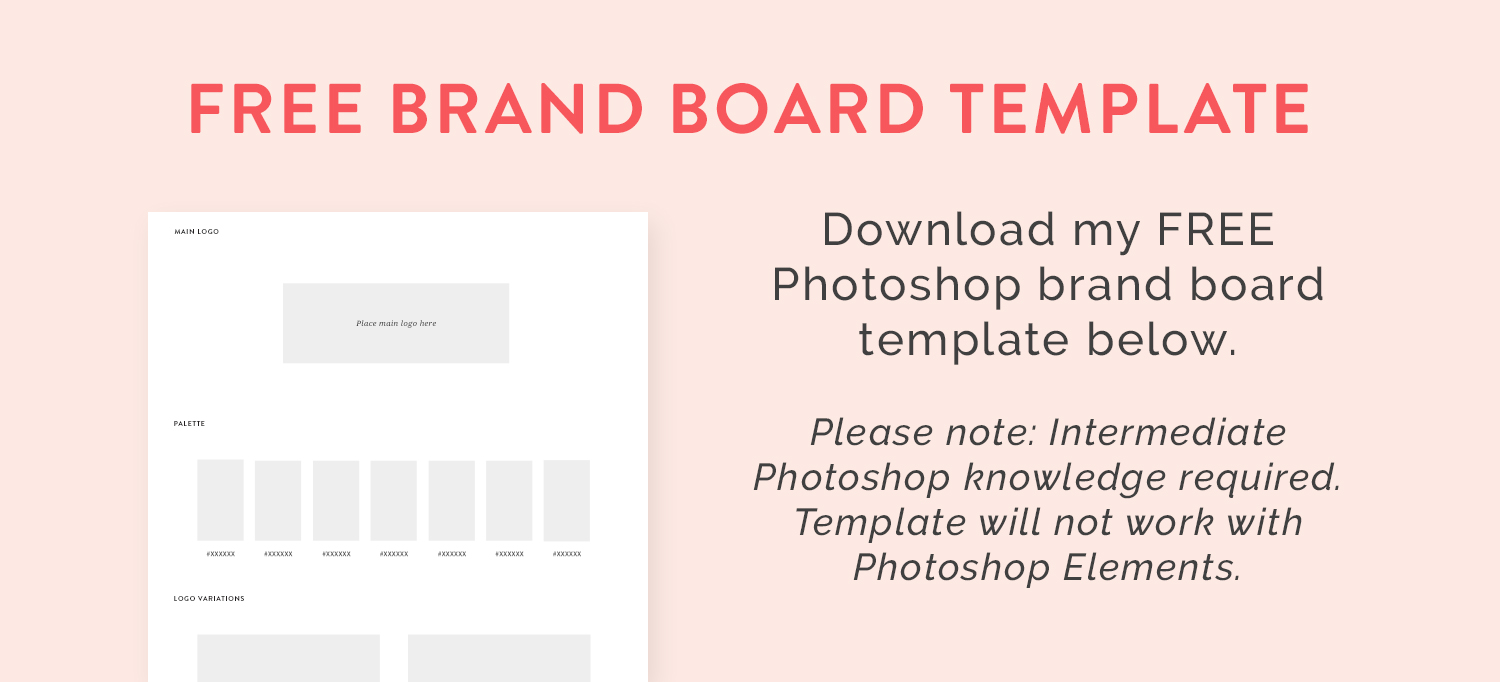
After spending the last few months working on my course, Organize & Automate, and recording lessons to help designers automate their design process, I thought I'd share a snippet from the course! So here it is.
Let's dive into brand boards and why you should be creating them for your clients- and how!
A brand board is an at-a-glance document containing all your brand elements- from your main logo to your color palette. You may have seen them floating around Pinterest but not understood what they were. Or, if you're a designer, you may want to start creating brand boards but you don't know where to start.
Let's start with why you should create brand boards.
Brand boards show the client every element of their visual brand- all together in one neat document. They're important because they help convey a brand’s values, attributes and personality in one glance.
When you’ve designed blog graphics, prints or anything else for your business (or for your clients), its helpful to look at the brand board and check that what you’ve designed is in line with the colours, fonts, graphics and overall identity that is on the board.
That isn't the only reason brand boards are important though. If you're a designer like me, have you ever thought about what you're going to do if one of your clients comes back to you for work and you're not available?
You'll need to refer them to another designer. If you made a style guide for them, their new designer will be able to use that to expand on their branding without ruining all the hard work you put in to make it look so damn gorgeous in the first place.
Clients benefit from brand boards because they can easily find their color codes and font names on them.
Would you be a very happy client if you went away from the project with lovely branding, but no idea what fonts and colours were used? No idea how what to use to create additional brand materials in the future? I wouldn't.
Brand boards are totally different to style guides, so try not to confuse the two.
Style guides include instruction on how to use your brand elements, such as how much spacing a logo should have around it, or what backgrounds your logo can and can’t be used on… I prefer to think of style guides as identity guidelines. They can be pretty complex, but brand boards are simple boards that only include your brand elements — not instructions on how and where to use things.
(Psst! I talk all about creating style guides, moodboards and other time-saving templates in my course, Organize & Automate.)

Here's what I include in my brand boards:
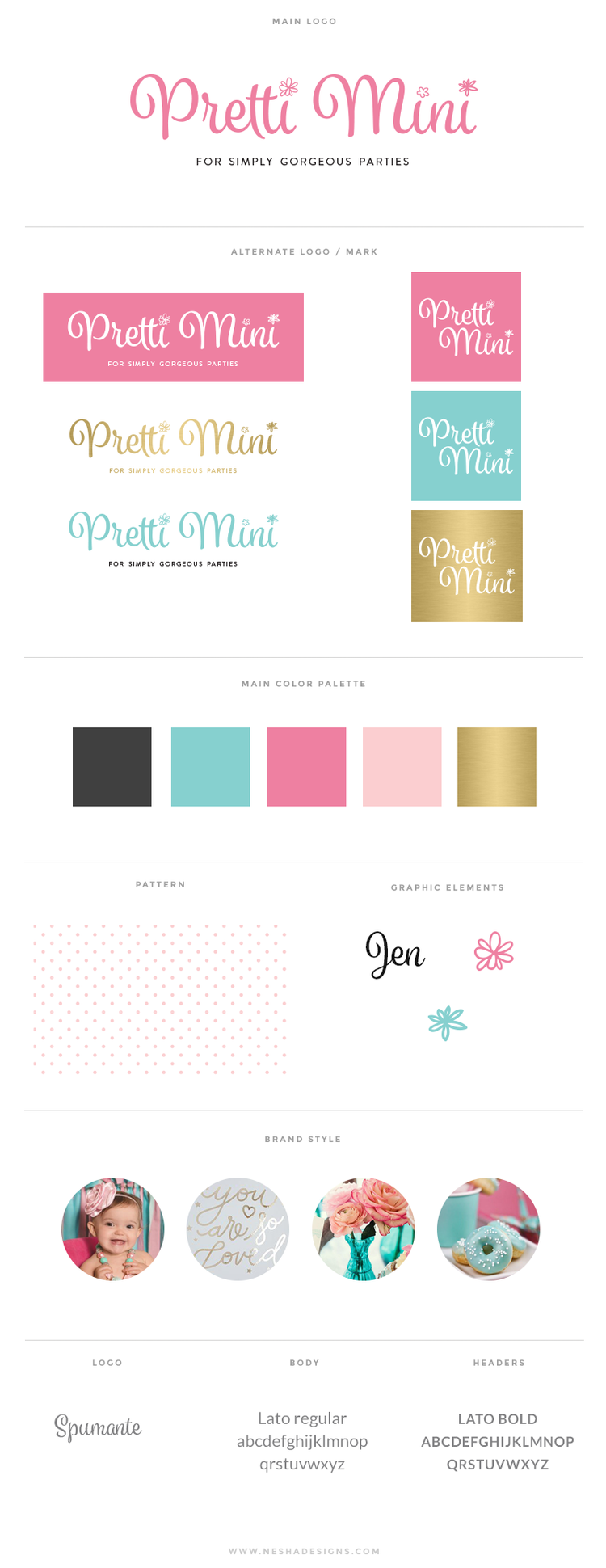
1. Main logo
The main logo is used on the client's website, on their stationery and usually on PDFs etc.
2. Logo variation
This is another version of the main logo, with a slight difference. It could be a vertical version, it could have a shape around it, it could be in another color, or it could be textured...
It's a good idea to offer your clients a logo variation because you never know when they might fancy changing things up. Clients don't want a basic brand- they want a brand that's cohesive, but still interesting!
3. Sub mark
A sub mark is another element that is pulled from the main logo. It's usually smaller than the main logo, and is often used as a favicon or profile picture.
Sub marks are especially helpful to brands with long business names because they provide a simple alternative to their main logo. Sub marks also make great watermarks because they're usually in a circular shape and fit nicely in the corners of photos.

4. Main color palette
I create a main color palette that consists of 5 colors. These colors reinforce the 'vibe' of the brand.
For example, a feminine brand may choose pastel colors to help add to their romantic brand vibe, and a corporate agency may choose dark or bold colors to give off a feeling of power.
On your client's brand board, make sure you include the hex codes for their colours. If you want to be even more helpful, you can provide the RGB, CMYK and Pantone values!
5. Supporting palette
A supporting colour palette is a set of extra colours that compliment the main colour palette nicely. These colors can be used in blog post graphics, social media posts and other brand graphics to inject more variety while still remaining cohesive.
6. Supporting pattern
A pattern is a nice way to add to the aesthetic of your brand. For example, a feminine brand could strengthen their girly vibe with a polka dot pattern! Patterns are usually used on print design, social media designs and PDF designs.
7. Fonts
Fonts have to be chosen very carefully when creating a visual identity for a client. Just like a color palette, fonts can make or break the brand vibe you're trying to give off.
Script fonts are often used for feminine brands, whilst chunky sans serif fonts could be used for modern brands. Whatever the font, make sure you include all font names and their uses in your client's brand boards. Tell your client which fonts should be used for paragraph text and headers.
These elements make up a visual identity, but there's also so much more you can add! Once you have the basics in place, you can create social media branding, PDFs, print designs, course designs and more.
Brand boards contain the very core of your client's brand identity. They guide every visual decision your client will make, so make sure you include one in your client's final files.
Do you have a brand board of your own? If you're a designer, what is your favorite part of the design process? Leave a comment and let me know!